
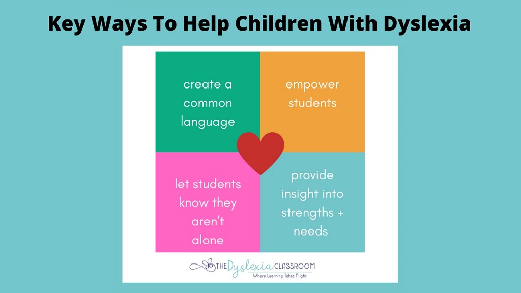
Dyslexia affects millions of people worldwide. It impacts how they read, write, and process information. Creating dyslexia-friendly environments benefits everyone, not just those with dyslexia. Hawaii Web Studio specializes in accessible design solutions that make content more inclusive and user-friendly.
Making materials accessible requires thoughtful planning. However, the changes are often simple and cost-effective. Additionally, these improvements enhance readability for all users, including those with other learning differences.
Understanding how to make things dyslexia friendly starts with recognizing common challenges. People with dyslexia may struggle with letter recognition, word spacing, and text processing speed. Therefore, small adjustments can make a significant difference in their reading experience.
Understanding Dyslexia and Its Impact
Dyslexia is a neurological condition that affects reading and language processing. It occurs in people of all intelligence levels and backgrounds. Moreover, it is not related to vision problems or lack of education.
People with dyslexia often experience difficulties with phonological processing. This means they may struggle to connect letters with their corresponding sounds. Consequently, reading becomes more challenging and time-consuming.
Furthermore, dyslexia can affect working memory and processing speed. These challenges extend beyond reading to include writing, spelling, and organizing information. Nevertheless, with proper support and accommodations, people with dyslexia can succeed in all areas of life.
Font Selection and Typography
Choosing the right font is crucial for dyslexia-friendly design. Sans-serif fonts work better than serif fonts for most people with dyslexia. The clean lines and simple shapes reduce visual confusion.
Arial, Verdana, and Tahoma are excellent font choices. These fonts have clear letter distinctions and adequate spacing between characters. Additionally, they maintain readability at various sizes.
Avoid decorative or script fonts entirely. These fonts can be beautiful but create unnecessary reading barriers. Instead, prioritize clarity and simplicity in all text elements.
Font size matters significantly for accessibility. Use at least 12-point font for body text, with larger sizes for headings. However, 14-point font or larger is often preferred for improved readability.
Color and Contrast Considerations
High contrast between text and background improves readability dramatically. Black text on white backgrounds provides maximum contrast. Nevertheless, some people with dyslexia prefer slightly softer combinations.
Dark gray text on cream or off-white backgrounds can reduce glare. This combination maintains good contrast while being easier on the eyes. Therefore, consider offering multiple color scheme options when possible.
Avoid using color alone to convey important information. Some people with dyslexia also have color vision differences. Additionally, use consistent color schemes throughout your materials to reduce cognitive load.
Background patterns or images behind text should be avoided completely. These elements create visual noise that interferes with reading comprehension. Furthermore, they can cause letters to appear to move or blur.
Layout and Spacing Strategies
Generous white space improves reading comprehension significantly. Avoid cramming too much information onto a single page or screen. Instead, use plenty of margins and spacing between elements.
Line spacing should be at least 1.5 times the font size. This extra space prevents lines from appearing to run together. Moreover, it gives readers’ eyes a clear path to follow.
Left-aligned text works best for most readers with dyslexia. Justified text creates uneven spacing between words, which can be distracting. Additionally, centered text should be used sparingly and only for short phrases.
Break up large blocks of text with headings and subheadings. These elements help readers navigate content and take breaks as needed. Furthermore, they create visual landmarks that aid comprehension.
Content Structure and Organization
Clear, logical organization helps all readers process information effectively. Start with an overview or introduction that outlines the main points. Then, present information in a logical sequence.
Use bullet points and numbered lists to break down complex information. These formats make content easier to scan and understand. However, avoid overly long lists that might overwhelm readers.
Headings and subheadings should be descriptive and meaningful. They serve as roadmaps for readers navigating through content. Additionally, consistent heading styles help establish visual hierarchy.
Include summaries or key takeaways at the end of sections. These elements reinforce important information and provide closure. Moreover, they help readers confirm their understanding before moving forward.
Digital Accessibility Features
Digital platforms offer unique opportunities for dyslexia-friendly design. Text-to-speech functionality can be invaluable for many users. Therefore, ensure your digital content is compatible with screen readers and assistive technologies.
Provide options for users to adjust font size, spacing, and colors. These customization features allow individuals to optimize their reading experience. Additionally, they demonstrate commitment to inclusive design.
Use clear, descriptive alt text for images and graphics. This practice benefits users of screen readers and those who struggle with visual processing. Furthermore, it improves overall content accessibility.
Ensure that navigation elements are clearly labeled and consistently positioned. Predictable layouts reduce cognitive load and help users focus on content rather than interface elements.
Practical Implementation Tips
Start with small, manageable changes rather than attempting complete overhauls. Focus on high-impact improvements like font selection and spacing first. Then, gradually implement additional accessibility features.
Test your materials with actual users, including people with dyslexia. Their feedback will be invaluable for identifying areas for improvement. Moreover, regular testing ensures that changes actually improve the user experience.
Train team members on dyslexia-friendly design principles. This education ensures consistent implementation across all materials and platforms. Additionally, it builds awareness and empathy within your organization.
Document your accessibility guidelines and standards. This documentation helps maintain consistency and provides reference material for future projects. Furthermore, it demonstrates organizational commitment to inclusive design.
Benefits Beyond Dyslexia
Dyslexia-friendly design principles benefit many other user groups. People with autism, ADHD, and visual processing differences also appreciate clear, well-organized content. Therefore, inclusive design serves a broader audience than initially expected.
Improved readability benefits non-native speakers and people with varying literacy levels. Clear fonts and logical organization make content more accessible to diverse audiences. Additionally, these improvements can boost overall user engagement and satisfaction.
Search engines favor well-structured, accessible content. Proper headings, clear navigation, and optimized text contribute to better search rankings. Moreover, accessible websites often perform better in user experience metrics.
Read More Also: How to Stop Apps From Auto Updating in Android and iPhone
Conclusion
Creating dyslexia-friendly materials requires attention to detail but delivers significant benefits. Simple changes like font selection, proper spacing, and clear organization make content more accessible to everyone. These improvements enhance user experience while demonstrating commitment to inclusive design.
Remember that accessibility is an ongoing process, not a one-time fix. Regular testing, user feedback, and continuous improvement ensure that materials remain effective and inclusive. By implementing these practical tips, organizations can create environments where all users can succeed and thrive.
Read More Also: The different types of SEO you need to know about
Frequently Asked Questions
What is the best font for people with dyslexia?
Sans-serif fonts like Arial, Verdana, and Calibri work best for people with dyslexia. These fonts have clear letter shapes and good spacing between characters, making them easier to read and reducing visual confusion.
Does colored paper help with dyslexia?
Some people with dyslexia benefit from colored paper or overlays, particularly cream, light yellow, or pale blue. However, preferences vary among individuals, so it’s best to offer options and let users choose what works best for them.
How much white space should be used in dyslexia-friendly design?
Generous white space is essential for dyslexia-friendly design. Use at least 1.5 line spacing, wide margins, and plenty of space between paragraphs and sections. This reduces visual clutter and makes text easier to follow.
Are there specific colors to avoid when designing for dyslexia?
Avoid high-contrast combinations that create glare, such as bright yellow text on white backgrounds. Also avoid using red and green together, as some people with dyslexia may have color vision differences. Stick to clear, comfortable contrast ratios.
How can I test if my content is dyslexia-friendly?
Test your content with actual users who have dyslexia, use readability tools to check complexity levels, and review your design against accessibility guidelines. Additionally, try reading your content aloud or using text-to-speech software to identify potential issues.


